PSB Mrówka
The Mrówka project was created in cooperation with a store supplying landscaping, construction and building materials.
My role was to change the UI Design of the website. I based it on the
assumptions of the business
that clearly presented a vision for the final product.
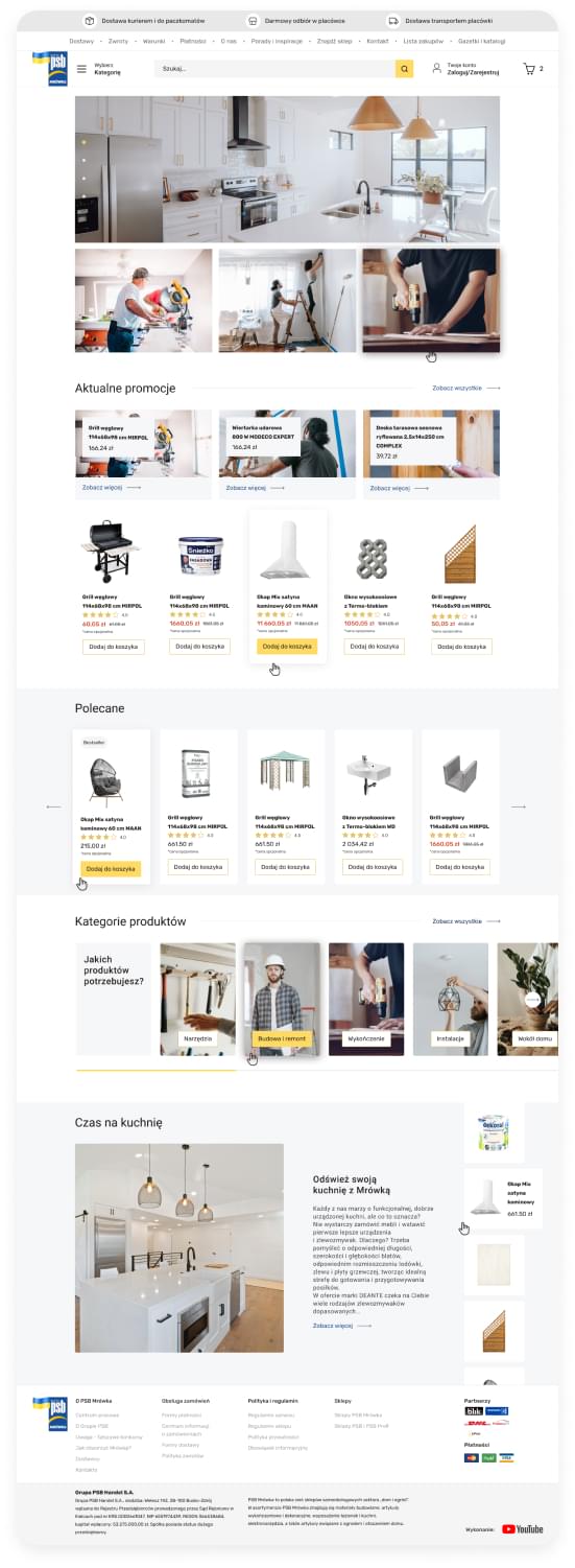
My project is a redesign of the current website.

Problem Statement:
My main goal in this project was to make the website more clear, more concise and modern. I wanted products to be more visible and to have all elements that are important for the client to see at first glance.
Challenges:
Some elements on the website aren't perfect ux, due to the lack of resources and capacity to conduct research process. That's why I had to make decisions in line with good practices and my experience as UX Designer.
How do I want to achive our goal?
Discover
Define
Design
What I would do differently?
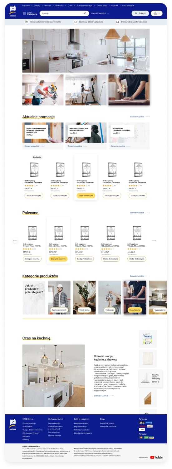
The first project was my proposal, which was finally slightly modified according to the client's requirements. In addition to changing the colors and design of the buttons, the search bar has also been reduced. What's more, the client decided to hide the tabs in the footer by three dropdowns.
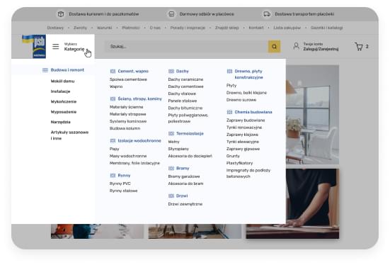
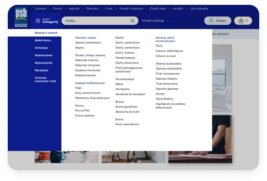
The element that I would have designed differently is probably the navigation, which I had a big problem with due to the client's requirements regarding a dozen tabs in the header and the reduction of information about products to one button "all products"/”categories”.
In my opinion, the header and navigation is the most important part of the website which must include both users and business goals. Other less important information such as: “returns, about us, conditions” should be in the footer. Also, there is some information that we (as users) are used to. That's why users most often look for more information about delivery and returns in the footer not in the header.